LogoPrinciples
Logo Principles
The DroidBuilder's logo is a symbol for our club that is highly regarded all over the world. It plays a crucial role in communicating and reinforcing our authenticity and heritage. All great brands have one thing in common: consistency. Use the tools to make sure you're expressing the DroidBuilder's brand in just the right way.
Primary Logo
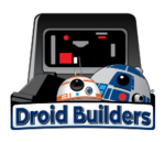
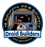
The primary DroidBuilder's logo should appear on most DroidBuilder's communications. There are two approved versions of the logo. One, for standalone use, the other logo is suitable for use when used in conjunction with other clubs to achieve a more unified look.
Standalone Logo
Circular Logo
Clear Space
<NEED graphic showing space>
Give it space. To preserve the integrity and visual impact of the logo, always maintain adequate space around it. The clear space around the logo is an integral part of the design. It ensures the logo can be seen quickly and is undiluted by other logos, symbols or text. Space should be equal to half the height of the logo as it is being used.
Minimum Size
The logo should not be used at less than .25" with no less than 15-point logo type.
Logo Don'ts
Unauthorized logo modification comprimise the Droidbuilders brand. Please do not attempt to recreate or alter the logo yourself. Only use provided DroidBuilders logos.
- Do not rotate the logo
- Do not alter the name orientation
- Do not change the approved typeface
- Do not recolor the logo
- Do not insert images or graphics into the logo
- Do not crop logo
- Do not place logo atop imagery
Sector, Regions, and Zone Logos
Branded locations are the local area clubs where the outreach with the public most occurs. Logos will be added as they are approved.
- BlackSun Sector
- Los Angeles Sector
- MidAtlantic Sector
- NorthEast Sector
- San Diego Sector
Usage Matrix
| Logo Type | Location Specific Marketing | Advertising | National Marketing | Corporate Marketing |
|---|---|---|---|---|
| X | X | X | ||
| Sector/Region/Zone Logo | X | |||
| Medallion | X | X | X | X |

